Prose & Poetry
2 Weeks - Concept - Solo Project
Overview
Deliverables: High-Fidelity prototype and presentation
Tools :
My role: Researcher and Designer
Client
Prose and Poetry is a Highgate based bookstore that has been active since 2010. With a focus on customer service and having a wide range of literature, they seek to spread knowledge and culture to combat racism.
Brief
Redesign their eCommerce website to encourage users to complete purchases
Showcase their products while maintaining their brand image

Discover
To start off the design process, I needed to better understand Prose and Poetry users' problems and needs.
Screener Survey
I ran a screener survey to gain a quantitative understanding of users’ book purchasing behaviours. This would then allow me to develop my qualitative questions moving into my user interviews. I received 13 responses, and these were the key insights:
10 users purchased their books in store
11 users purchased their books online
Of those who purchased books online, 9 of them had purchased their books through Amazon and/or Waterstones
The top 3 criteria when making purchases online were:
Receiving recommendations
Seeing reviews
Ease of use of the checkout process
User Interviews
From this survey I recruited 5 participants for further user interviews to gain more qualitative data on the book purchasing experiences. During these interviews, I was able to get deeper insights into the issues users face when purchasing books, and with shopping online in general.
Using the insights gained through the interviews, I was able to distil the findings into an affinity map, which allowed me to spot trends amongst the users.
The key insights I found were:
Users value recommendations and reviews when shopping
Users want a smooth and efficient check out process because they shop online for convenience
Users like to shop online when they know what they want
Users enjoy having the ability to browse
Competitive Analysis
From the screener survey, many of the users who had purchased their books online had done so through Amazon and/or Waterstones. Another user had done so through a bookshop from Hong Kong called Bookazine. A competitive analysis was conducted to compare the checkout process for each bookshop’s eCommerce site.
Task Analysis
The task for each website was to locate a specific book, and then proceed through the checkout process and purchase the book.
Features Inventory
A features inventory was also done to compare the websites and help consider what features could be adapted to improve our eCommerce site.
User Journey
After completing the task analysis, I used insights from the user interview to put together a user journey in order to really understand the pain points of that particular task, and ideate on possible opportunities for which to provide solutions.
While many users in the interviews had identified delivery times as a prominent pain point, I felt that this was not a pain point that could be addressed through the website.
The pain point that I felt had the most possible solutions was that of the tedious order/checkout process. This can be seen highlighted above with the green rectangle.
Define
User Persona
Utilising information gained from my affinity map and user journey, I created the persona of Angela. Creating a persona would give me a more focused approach to my design, as I would only have to design for their needs, instead of trying to cater to every possible pain point.
Problem Statement
In order to guide me through the ideation phase, I needed to hone in on what the key problem was. Once I had a clear understanding of what the needs and pain points were for our user, I was able to narrow it down to this problem statement:
Angela needs to have a quick and convenient check out system so that she can speed up her purchasing process and more efficiently purchase her books online
How Might We’s
Once I understood what Angela’s problem was, I was able to start brainstorming possible solutions.
I decided to focus on that “How Might We” as I felt it was within the scope of the project. While deliveries and order tracking were a prevalent pain point for users, and thus also for my persona, I did not feel that it was a pain point that could be addressed by changing the UX of the website.
Develop
Crazy 8s
Guided by the How Might We Statements, a quick “crazy 8” was used to brainstorm potential solutions that could be used to help solve Angela’s problem.
The ideas that stood out from this brainstorming session included:
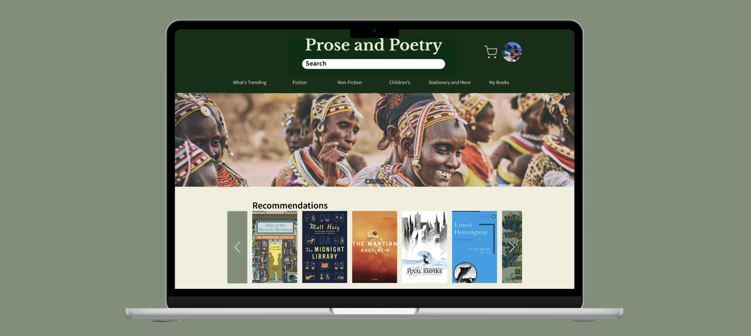
Making recommended books more prominent on the home page
Allow for filtering options to help Angela narrow down her search
Adding a favourites list
Home Page
User Flow
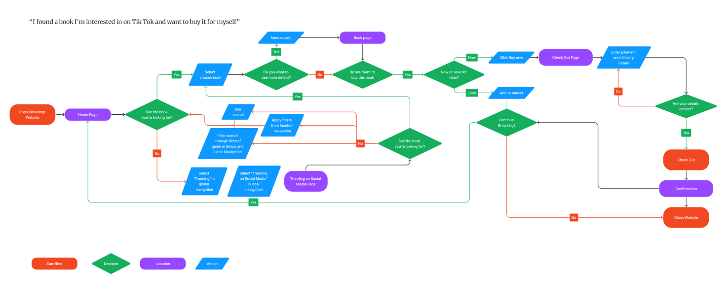
Using the task of searching for a specific book, a user flow was created so that I could work out what the main pages for the website would need to be.
The main pages identified were:
home page
book details page
landing page for each category
checkout page
payment confirmation page
In order to accommodate both users who wanted to browse, and those that knew which books they wanted to buy, multiple paths were designed which would allow both groups to complete the task.
Card Sorting
As the bookstore would have a wide inventory of books, I conducted an open card sort in order to figure out how users would categorise the items.
From the card sorting, I learned that users mostly categorised books by their genre. However, they also separated Children’s books as their own category regardless of the genre. One user categorised the genres as subcategories under Non-Fiction and Fiction.
Wireflow Sketches
Based on the pages highlighted in the user flow, I drew up some sketches of what those pages could look like.
Book Details Page
Checkout Pages
Wireframes
After some rough sketching of what the general layout for each page should look like, it was finally time to start designing some wireframes.
Lo-Fi
I started with translating the sketches into very low-fidelity wireframes while designing everything on a grid. This allowed me to see how things could be laid out before incorporating text.
This was the first iteration of the mid-fidelity wireframes. Using these wireframes, I then went into conducting some usability testing to confirm whether or not the flow of the website actually worked.
Usability Testing
As identified through the insights of the user interviews, it was important to users to have a smooth and efficient check out process. Because of this, the main metric used in my usability testing was speed.
The goals that I was hoping the users would achieve were:
Be able to find a particular book in less than a minute
Be able to proceed to the check out and pay for their book in less than 2 minutes
I chose to measure using these timings because users had stated that they typically go online when they want something in particular, and thus the process should be a relatively quick one.
The scenario given to the users was that they had discovered this book on social media, and wanted to purchase it on our store.
All the users were able to complete the tasks within the given timeframe, however they were able to provide some other insights to further enhance the pages.
Pluses
The flow is clear, straightforward and works as expected
Reviews displayed with book information clearly visible
Deltas
Want to see related books
Sizing of certain elements were “a bit strange”
Not enough feedback on the payment confirmation page
Unclear wording
Not enough information on the homepage
Style Guide/Mood Board
Due to the timeframe of this project sprint, I went straight into hi-fidelity when iterating my wireframes with the feedback from the usability testing. To get a better sense of what the feel of the website should be, I created a moodboard.
Mid-Fi
I chose to use a serif font for the main titles and headings of the website, as it would be recognisable as fonts used in a book. After doing some exploration with different font pairings, “Libre Baskerville” was chosen for the titles, and “Source Sans Pro” was selected for the body and subheadings.
Going back to what users had said during the user interviews, I understood that users liked being able to browse and explore books when inside a physical bookshop. I wanted to emulate that feeling when users were using the website. I used the concepts of “Nature”, “Exploration”, and “Calmness” to select the images in the moodboard.
These colours used were pulled from the images in the mood board. The beige was chosen as the base colour of the page as it was reminiscent of the colour of pages in a book, and due to it being a neutral colour, it would make the images of the book covers easier to see on the page. The green and brown were chosen as they evoked the feeling of being in nature.
Iterations
Before
Adding a hero image allowed me to display more features that were mentioned in the brief of the project. The bookshop had mentioned containing lots of books on African and Caribbean literature, and so adding a hero image allowed for it to be highlighted on the homepage. This also addressed the insight that the homepage could include more information as it looked a bit bare.
Another change that was made in the next iteration was adding more recommendations on the book description page. Having recommendations was important to users, and adding similar books on the book description page also gave users a more efficient process to browse through the site.
Finally, I cleaned up the look of the confirmation page. I made it so that an order number and date were displayed when the user completed their order so that they received feedback that their order had gone through. In addition to that, I removed the rectangle around the text so that the “done” call to action button stood out more on the page.
Deliver
Answering the Brief
With my final prototype, I was able to:
-Provide multiple ways for users to search for content on the website
-Implement a smooth check out system, made quicker with the autofill feature
-Highlight relevant and/or popular topics
-Provide descriptions and reviews for each product
Next Steps
If I were to continue working on this project then these would be the next steps I would take to improve:
I would continue to iterate in mid-fidelity using the feedback from the usability testing.
Conduct further usability testing on the wireframes with implemented changes.
Consider other pain points from the user research and consider implementing features to accommodate them.
Conduct usability testing on the hi-fidelity prototype to understand how users feel about the UI of the website.
Key Learnings
After
The importance of usability testing. It’s easy to get carried away with minute details and prototyping to make sure everything works, but the best way to see if things work intuitively is to have other people test them. There isn’t much point trying to make a component have several interactions if a user isn’t instinctively going to use it.
Facilitating user interviews doesn’t have to be so nerve-wracking. I felt very anxious going into my first interview because I wasn’t sure if my questions were going to give me relevant answers, or if I would be able to make the whole process feel natural for the people I was interviewing. However, once the interviews were underway, I found that it was actually not as bad as initially thought, as I was able to identify where users could expand their answers and encourage them to do so.


